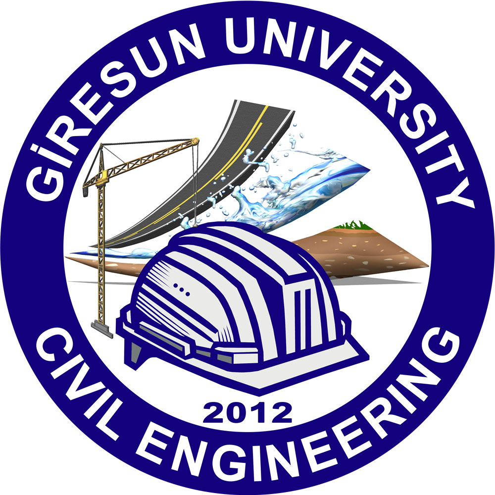
The corporate identity of our department is represented through a logo language that brings together the fundamental sub-disciplines of engineering and a holistic education-research approach with symbols.
Logo Concept
Our department logo symbolizes the department's academic accumulation, diversity of working areas, and sustainable future goal by uniting the different sub-disciplines of Civil Engineering under a common corporate identity.
Structure
Construction Materials
Hydraulics
Mechanics
Geotechnics
Transportation
Construction Management
Establishment: 2012
Undergraduate Education: 2016-2017
Meaning of the Elements in the Logo
Hard Hat
Represents modern engineering, advanced technology, and innovative construction understanding.
Crane (Structure-Mechanics)
Associates structure and mechanics fields with engineering power and technology.
Road Symbol (Transportation)
Symbolizes highways and transportation infrastructure studies.
Water / Flow (Hydraulics)
Refers to hydraulic structures, hydraulics, and fluid mechanics fields.
Soil and Green Area (Geotechnics)
Represents the examination of soil layers and soil-structure interactions.
Aggregate Particles (Materials)
Emphasizes material behavior and strength-based engineering approach.
Holistic Design (Construction Management)
Expresses planning, organization, and management approach.
Three Lines and Blue Frame
Symbolizes the corporate bond with Giresun University and harmony with university colors.
Logo Usage Principles
- Aspect Ratio Conservation: The logo must be used preserving original aspect ratios; it must strictly not be stretched.
- Color and Resolution: Corporate colors should not be changed; pixelated or low-resolution visuals should be avoided.
- Visibility: Sufficient space should be left around the logo; readability must be ensured on complex backgrounds.


